
Aura Home Page Template: The Complete Guide to Building a High-Converting HubSpot Homepage

Published Jun 26, 2026
Updated Jun 26, 2026
12 min read
Your homepage is not a brochure. It is the single most valuable real estate on your entire website—and on HubSpot CMS, the page template you choose determines whether that real estate works for you or against you. The Aura Home page template is engineered as a complete conversion funnel in a single scroll: awareness at the top, credibility in the middle, objection-handling before the close, and a final call-to-action that gives visitors a clear next step.
If you are evaluating HubSpot themes, migrating from a legacy site, or launching a SaaS or agency brand for the first time, this guide walks through every section of the Aura Home template, the modules that power it, the business objectives it fulfills, and how to customize it without writing code.
What the Aura Home template is designed to accomplish
Most homepages fail for one of three reasons: they say too little, they say too much, or they never ask the visitor to do anything. The Aura Home template solves all three by following a proven narrative arc that mirrors how high-performing SaaS and marketplace sites convert traffic.
Primary objectives fulfilled by this template:
- Brand positioning — Establish who you are, what you offer, and why it matters within the first screen.
- Trust acceleration — Use metrics, testimonials, and feature proof to reduce skepticism before pricing appears.
- Commercial intent — Introduce pricing early enough to qualify buyers without forcing a premature decision.
- Objection removal — Answer common questions via FAQ before the final CTA.
- Conversion — Close with a high-contrast CTA banner that drives purchases, demos, or documentation visits.
Unlike generic HubSpot boilerplates that give you a blank canvas and wish you luck, Aura ships with copy, layout, and module defaults that reflect how modern B2B and theme-marketplace sites actually sell.
Template architecture: how the page is built
The Home template lives at templates/home.html in the Aura theme and extends the shared base layout, which means your global header and footer—powered by the Aura Site Header and Site Footer modules—appear automatically on every page. The main content sits inside a drag-and-drop area labeled Home, divided into eight full-width sections with zero default HubSpot wrapper padding. Each section controls its own spacing through module-level design tokens.
The page loads aura-home-sections.css, a scoped stylesheet that strips DnD gutters and enforces consistent vertical rhythm across breakpoints. Background colors alternate between warm cream (#FFFBF5) and sand (#EDE6D8), creating visual separation without harsh dividers—a signature of the Aura design system.
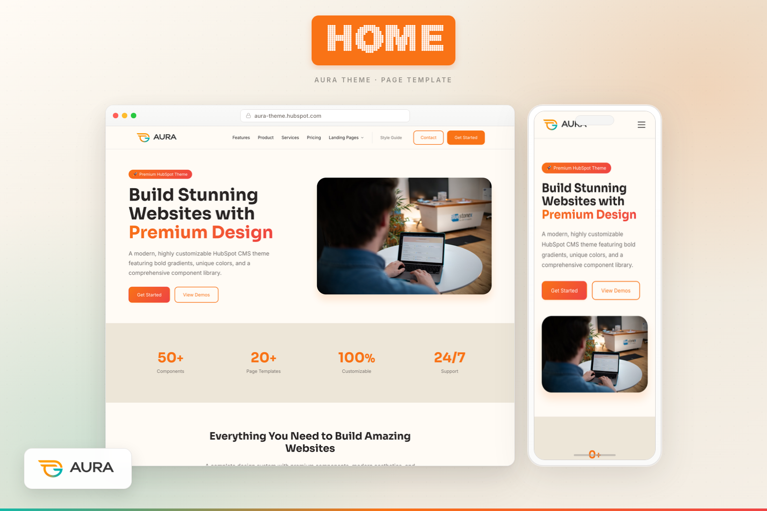
Section 1: Aura Hero Module — your first impression
The homepage opens with the Aura Hero module, a split-layout hero designed for product-led brands. Out of the box, it displays:
- A badge for urgency or category context (e.g., product version or offer type)
- A headline with optional gradient-highlighted text for emphasis
- A supporting subheading that expands on the value proposition
- Two CTA buttons—typically one primary (Get Started → Pricing) and one secondary (View Demos → Features)
- Trust items beneath the buttons (money-back guarantee, lifetime updates, premium support)
- A hero image on desktop for visual product proof
Why this module matters: Visitors decide in seconds whether to stay. The hero module combines emotional headline copy with rational trust signals, giving both emotional buyers and analytical buyers a reason to continue scrolling. The split layout keeps copy scannable on the left while the product visual anchors credibility on the right.
Customization tips: Swap the hero image for a product screenshot, marketplace preview, or team photo. Adjust badge text for seasonal campaigns. Point primary CTAs to your highest-converting destination—pricing, demo, or trial signup.
Section 2: Aura Stats Module — quantified credibility
Immediately after the hero, the Aura Stats module presents four animated counters: component count, template count, customization percentage, and support availability. Animation triggers on scroll, drawing the eye and making numbers feel dynamic rather than static.
Business objective: Social proof through metrics is especially effective for theme and SaaS products where buyers want evidence of depth and reliability. "50+ Components" and "20+ Page Templates" communicate breadth; "100% Customizable" addresses flexibility concerns; "24/7 Support" reduces post-purchase anxiety.
Module variants: Stats supports default, gradient, and gradient-text styles. On the homepage, the default variant keeps focus on readability while the sand background provides contrast from the cream hero above.
Section 3: Aura Feature Grid Module — benefits, not buzzwords
The third section uses the Aura Feature Grid module in a three-column layout with six cards: Premium Design System, Clean Code, Responsive Design, Modular Components, Performance, and Production Ready. Each card includes an icon, title, and short description.
Why a feature grid here: After metrics, visitors want to understand how you deliver on the promises in your hero. Feature grids translate abstract value ("great theme") into concrete deliverables ("design tokens," "modular components") that developers, designers, and marketing leaders each care about.
SEO benefit: These headings become indexable content that matches long-tail searches like "responsive HubSpot theme" or "modular CMS components."
Section 4: Aura Image + Text Module — storytelling with proof
The Aura Image Text module (showcase variant) delivers a split section titled "Premium Design Showcase" with a checklist of design qualities and a supporting image. This is your "show, don't tell" moment—the visual counterpart to the feature grid's bullet points.
Objective fulfilled: Mid-funnel education. Visitors who are still browsing need a narrative break from card-based layouts. The showcase variant feels editorial, building emotional connection before testimonials arrive.
Section 5: Aura Testimonials Module — human validation
Social proof peaks with the Aura Testimonials module, a Slick-powered carousel featuring five customer quotes with names, roles, avatars, and five-star ratings. Carousel format keeps the section compact while showcasing multiple voices.
Conversion psychology: Testimonials placed after features and before pricing reduce price sensitivity. Visitors think: "People like me bought this and succeeded." Replace default quotes with real customer feedback as soon as you have it—authenticity outperforms placeholder copy every time.
Section 6: Aura Pricing Module — soft commercial exposure
Before the hard close, the homepage introduces three pricing tiers—Starter, Professional (featured), and Enterprise—via the Aura Pricing module. This is intentional: exposing pricing on the homepage filters unqualified traffic early and accelerates qualified buyers who already know they want to purchase.
Module details: Each card includes price, feature list, and CTA button. The featured plan uses visual emphasis (border, badge, or gradient) to anchor the "most popular" choice—a proven pricing page pattern applied at homepage scale.
Objective: Reduce funnel steps for buyers ready to convert without visiting a dedicated pricing page. Visitors who need more detail can still navigate to the full Pricing template—which we cover in a dedicated guide linked at the end of this article.
Section 7: Aura FAQ Module — objection handling
The Aura FAQ module presents six accordion questions covering package contents, HubSpot compatibility, customization, support, client usage, and mobile responsiveness. Accordion UI keeps the page scannable while making deep answers available on click.
Why FAQ belongs on the homepage: Objections that go unanswered become exit reasons. Addressing "Can I use this for client projects?" and "Is it mobile-friendly?" before the final CTA removes friction for buyers who are 80% convinced but need one last reassurance.
SEO angle: FAQ sections can earn featured snippets when questions match search queries. Write questions in natural language—the way your prospects actually search.
Section 8: Aura CTA Banner Module — the close
The homepage ends with the Aura CTA Banner module in boxed gradient style: "Ready to Build Your Dream Website?" with buttons for Purchase Now and View Documentation. This is the conversion capstone—high contrast, minimal distraction, clear action.
Design note: CTA banners on sand or gradient backgrounds create visual finality. Visitors understand the page has concluded and their next step is binary: act or leave.
Global modules: header and footer on every page
While not part of the Home DnD area, the Aura Site Header and Aura Site Footer modules frame every homepage visit. The header provides logo, multi-level navigation, utility links, and dual CTAs with optional sticky behavior and glassmorphism dropdowns. The footer delivers link columns (Product, Company, Resources, Legal), social icons, and copyright.
Together, they ensure the homepage is never a dead end—visitors can navigate to Features, Pricing, Contact, or Documentation from any scroll position.
Theme-level benefits that power the Home template
- Design tokens — Colors, typography, spacing, and shadows controlled from Theme Settings propagate to every module automatically.
- HubSpot-native forms and CTAs — Buttons and links use standard HubSpot link fields; no custom integrations required.
- Performance-conscious CSS — Scoped section styles load only what the homepage needs.
- Accessibility — Semantic HTML, skip links, ARIA labels on navigation, and readable contrast ratios.
- Marketer-friendly editing — Every section is a discrete module instance; reorder, duplicate, or hide sections without touching code.
Who should use the Aura Home template
This template is ideal for HubSpot CMS theme sellers, SaaS companies, digital agencies, and product-led brands that need a homepage doing multiple jobs at once: brand story, product overview, social proof, pricing preview, and conversion. If your current homepage looks like a placeholder—or converts below 2%—the Aura Home template gives you a research-backed structure you can launch in hours, not weeks.
How the Home template connects to the rest of Aura
The homepage is the hub, but buyers rarely convert from a single page. Aura's template library includes dedicated pages for Features, Pricing, Contact, Services, multiple landing pages, blog templates, and documentation. The homepage introduces breadth; inner pages deliver depth.
For a module-by-module breakdown of how Aura presents product capabilities—including the Component Library module and Advanced Capabilities grid—read our guide to the Aura Features page template. It is the natural next step for visitors who click "View Demos" or want technical detail before purchasing.
Launch checklist for your Aura homepage
- Replace hero copy and image with your brand positioning.
- Update stats with real metrics—or credible projections for launch.
- Swap testimonials for verified customer quotes.
- Align pricing cards with your actual plans and checkout URLs.
- Rewrite FAQ questions from customer support tickets or sales calls.
- Point CTA buttons to live purchase, demo, or signup flows.
- Configure header navigation and footer link columns in global content.
- Preview on mobile, tablet, and desktop before publishing.
Editing the Home template in the HubSpot page editor
Launch your Aura homepage entirely in HubSpot's visual editor—no FTP required:
- Create the page — Marketing → Website → Website Pages → Create page.
- Assign Home template — Select "Home" under your Aura theme. Eight sections load pre-populated.
- Edit modules — Click any section; update Content, Style, and Advanced tabs inline.
- Reorder or hide — Drag sections in the left panel; toggle eye icon to hide during tests.
- Configure global header/footer — Edit once under Content → Global Content.
- Preview and publish — Test desktop, tablet, and mobile before going live.
Mobile and responsive behavior on the Home template
Aura Home modules use mobile-first breakpoints: split hero stacks copy above image below 992px; CTAs go full width under 576px. Stats, Feature Grid, Testimonials, Pricing, FAQ, and CTA Banner collapse from multi-column desktop to single-column mobile with touch-friendly carousel and accordion controls. Preview every section at 375px before publish.
Theme Settings fields that affect your homepage
Access Theme Settings via Design Manager or the page editor gear icon. Colors (primary accent, cream, sand) propagate to hero gradients, pricing borders, and CTA buttons. Typography controls heading and body fonts across all modules. Buttons define primary/secondary styles site-wide. Change tokens once—every homepage section updates automatically.
Extended module field reference for the Home template
Marketers who understand field-level controls ship faster. Key fields per module: Hero — badge, headline (gradient rich text), subheading, dual CTAs + links, trust repeater, hero image, layout (split/centered), overlay style. Stats — stat repeater (number, suffix, label), animation toggle, style variant. Feature Grid — badge, heading, card repeater (icon, title, description), column count. Pricing — plan repeater (name, price, features, CTA, featured toggle). FAQ — question/answer repeater, column layout. CTA Banner — heading, subheading, dual buttons, style variant.
Common mistakes to avoid on your Aura homepage
- Mismatched CTA destinations — Audit every link field before publish.
- Placeholder testimonials left live — Replace with real quotes or remove.
- Pricing that does not match checkout — Mirror Pricing page amounts exactly.
- Ignoring mobile preview — Test every section at 375px width.
- Skipping FAQ updates — Rewrite for your policies and support hours.
Persona-specific use cases
Marketers run scroll-depth reports and A/B test hero copy without developer tickets. Developers extend via module duplication—design tokens are CSS custom properties. Agency owners ship client homepages in hours and white-label under agency brand.
Additional SEO and internal linking guidance
Link homepage sections to inner pages with descriptive anchor text like "Explore our Features page" rather than "Click here." Mirror on your live site with links to /features and /pricing. Optimize meta description in page settings with primary keyword near the front.
Final word
The Aura Home page template is not a starting point you throw away—it is a conversion architecture you refine. Every module on the page exists because high-performing homepages consistently use that element: hero, proof, features, story, testimonials, pricing, FAQ, CTA. Aura simply packages them into a cohesive, editable, HubSpot-native experience so you can focus on message-market fit instead of layout experiments.
Publish the homepage. Measure bounce rate, scroll depth, and CTA clicks. Iterate copy before you iterate code. That is how world-class homepages are built—and Aura gives you the foundation to do it on HubSpot CMS from day one.
Keep Building — Explore More Setup Guides

Aura About Page Template: Build Trust, Tell Your Story, and Convert Candidates
 Chetan

Aura Landing Page Template: Promo Offers, Social Proof, and Lead Capture That Converts
Chetan

Aura Contact Page Template: Forms, Support Channels, and FAQ in One Conversion Hub
Chetan